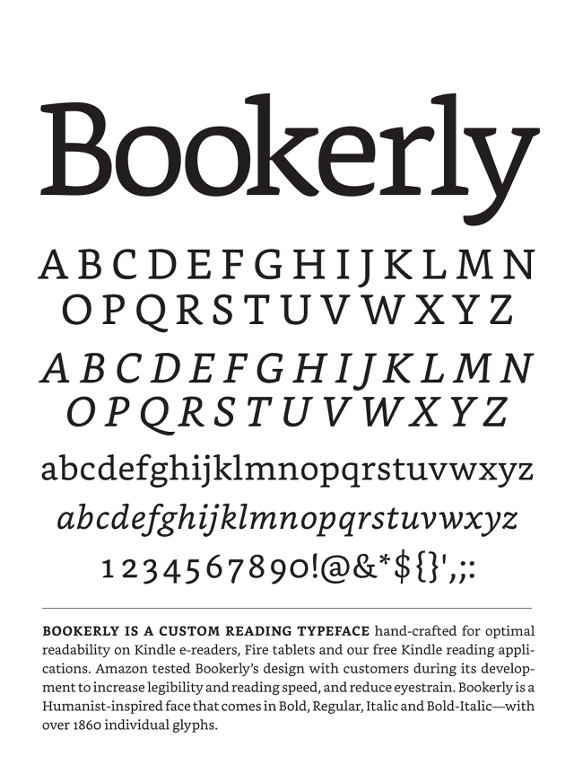
Bookerly
Finally my Kindle has a typeface all of its own, purpose-built, entirely from scratch. It’s been long overdue. Not only that but Bookerly just seems a much more welcoming font than Caecilia, which although described as having a "friendly, open quality' has also been called "the first-ever 'neo-humanist slab'".
Apologies to all the warm, fuzzy humanists out there. However Caecilia was never someone I particularly wanted to spend time with. She felt merely functional, a means to an end, and now Caecilia has served her purpose. She helped us transition from paper to screen, just when our expectations were so low. She was there in the beginning, like a good neighbour in your uncertainty after you’ve moved into a new house. She was helpful and willing to lend a ladder or point you in the right direction, but not someone you see yourself hanging out with long-term.
But now there's Bookerly. She’s here just for the reading - eager and engaged - and already she’s someone I'd like to spend a lot more time with.